For this project I was working in reverse from the way I usually do things. Normally, I would do a picture and then worry about framing it, but with this one I had already acquired a frame with a profile I really liked, glass and all.
This meant that the project would have to be on paper. The only paper I could find large enough for the project was the paper used for my print, “A Time To Remember“. It is a “hot press” paper (meaning it is extremely smooth and has virtually no “tooth” to it). As I still had a number of pieces in my possession, I decided to try it out.
While this kind of paper is required when doing off-set limited edition prints, it is a very challenging paper to use with artists materials, because it has very little “grip” for the pigments to hang on to.
A number of years ago I had purchased a box of ink pigment pencils (Inktense by Derwent) thinking they could have some interesting uses. Well, now they would be put to the test! First, I had to figure out how they would react to the smooth paper. And then how much abuse this smooth paper would allow. As it turned out, the paper is pretty tough stuff!
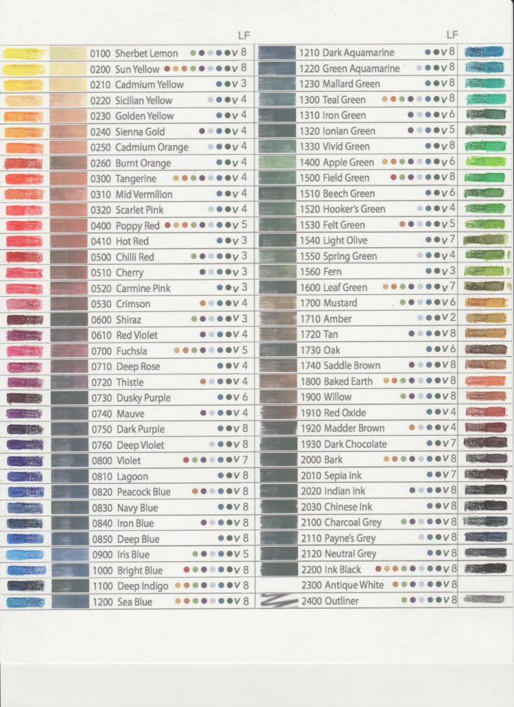
The colours on the Inktense pencils themselves, do not look the same as when the ink has been wet down. So I downloaded a chart with the 72 colours I would be using. To be certain (as chart colours may not be totally accurate) I made my own corresponding samples with the colours, dry and wet. This would be my reference chart for picking the right colors. I could use the colour dry or wet, but always had to remember that if a dry color ever got wet, it would change.
The other thing I had to always keep in mind was that the white inktense pigment does not work to give a pure white colour, but only to change another color, (such as adding white to red to give a pink color.) Therefore, anything white in the picture had to remain pure white paper, untouched by any pigment. (Which was a challenge in itself.)
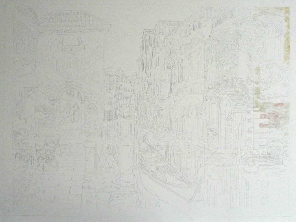
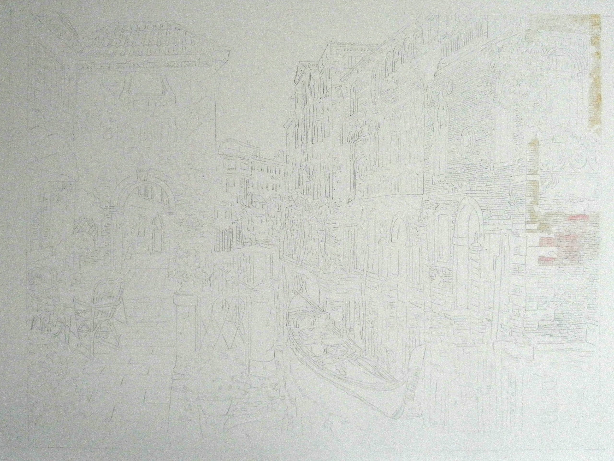
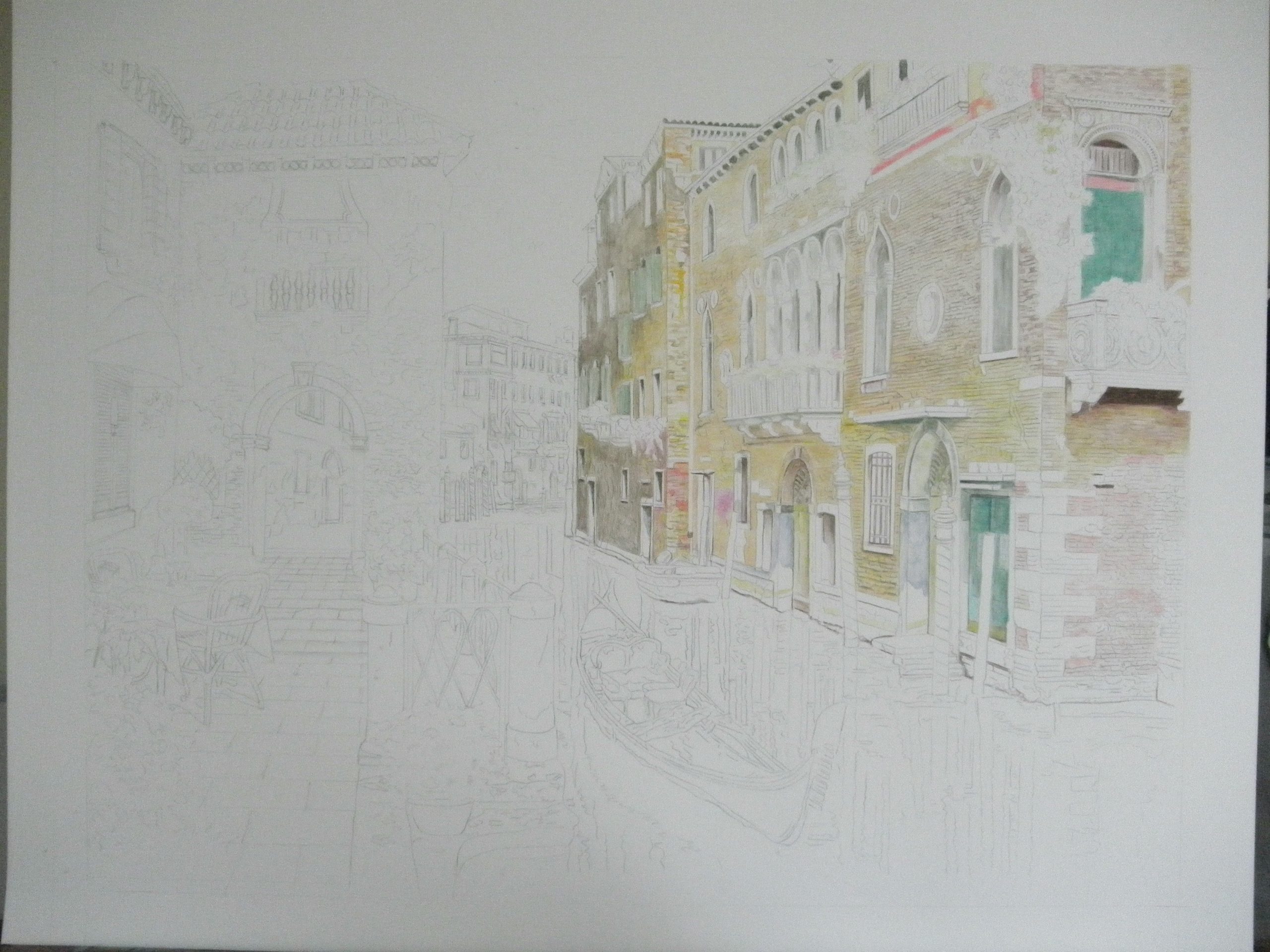
First of course, I draw my picture on regular paper and work out all the kinks. This is something I do for every art project no matter what medium I will be working with. Then I transfer it using graphite paper. In this project, I probably transferred too much detail. Though it is tough, the hot press paper doesn’t take well to erasing…so…the ink is going to have to be dark enough to cover all the transfer lines.
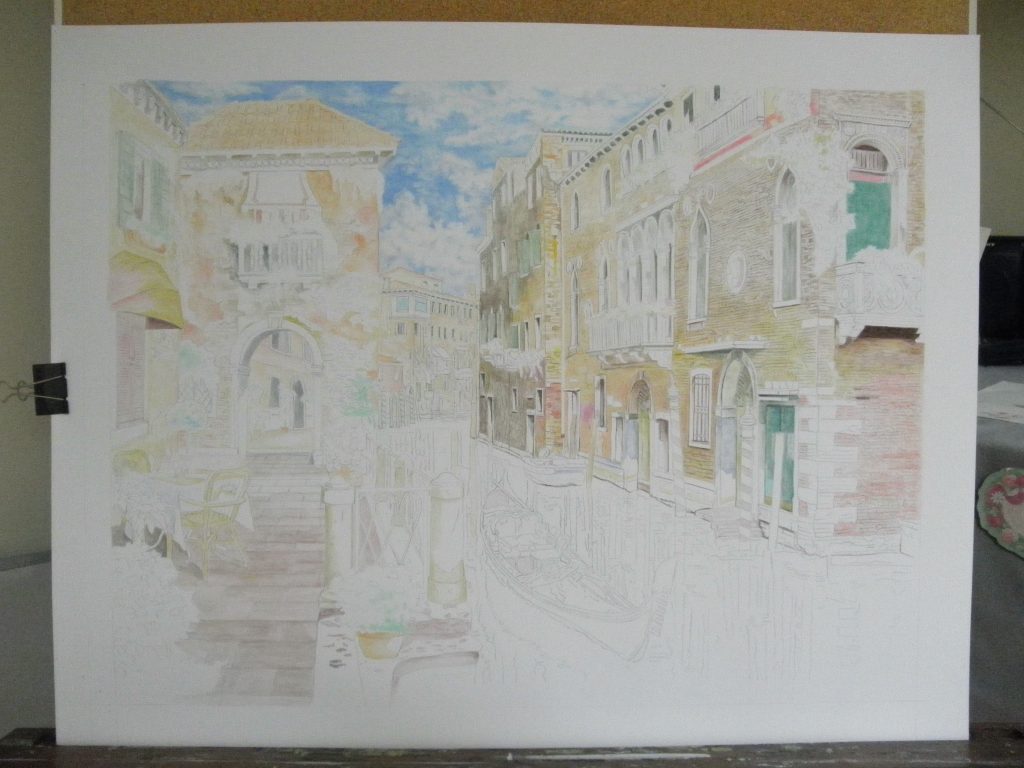
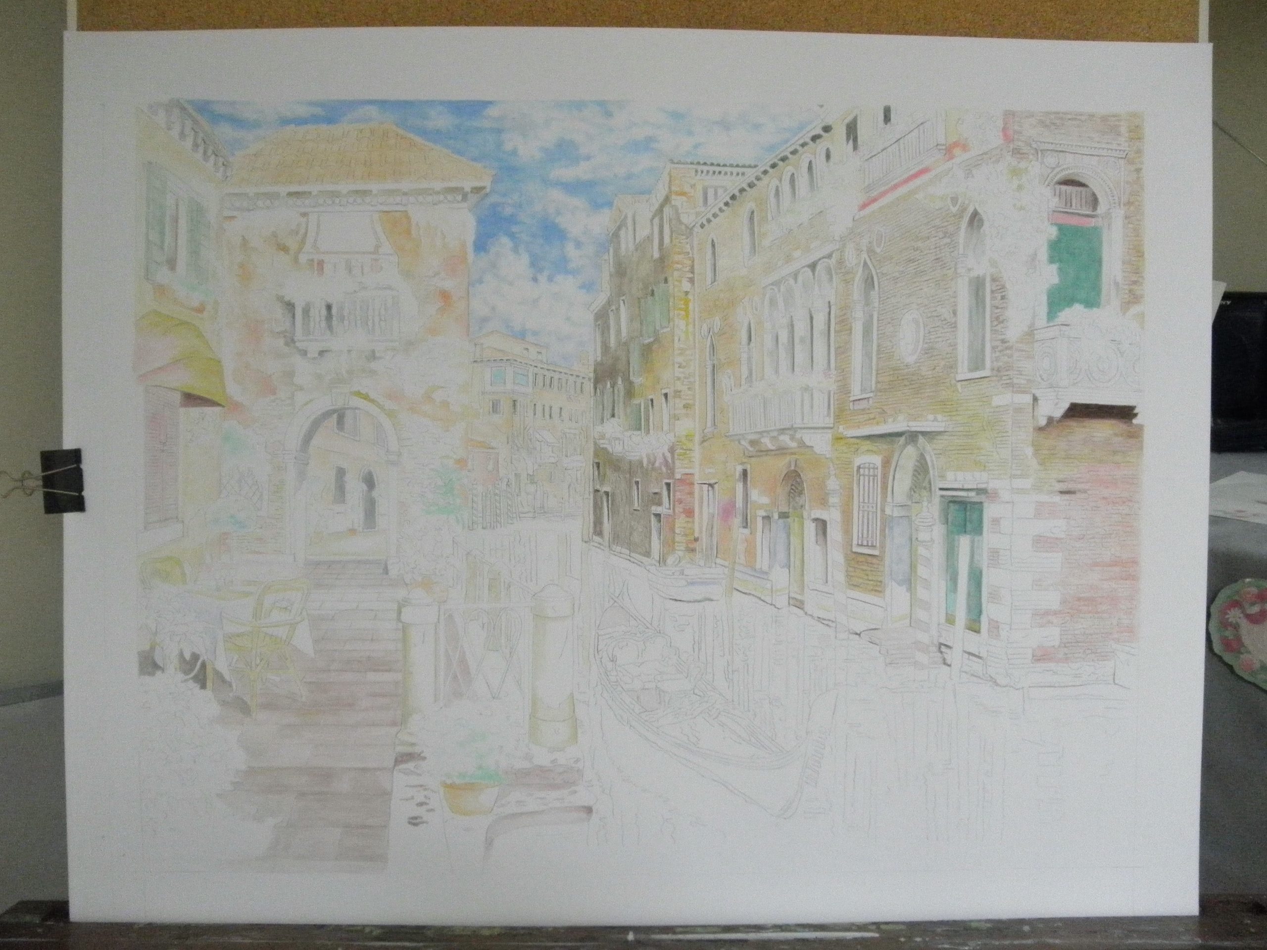
As you can see by the pictures below, the ink goes on extremely light…and all areas need to be blocked in with their base colours before I start applying the layers of ink.

Through research, trial, and error (mostly trial and error), I discovered there are many different ways to apply the ink pigment. Initially I was using the dry pencil to “colour” it in, and then wetting it with a wet paint brush.
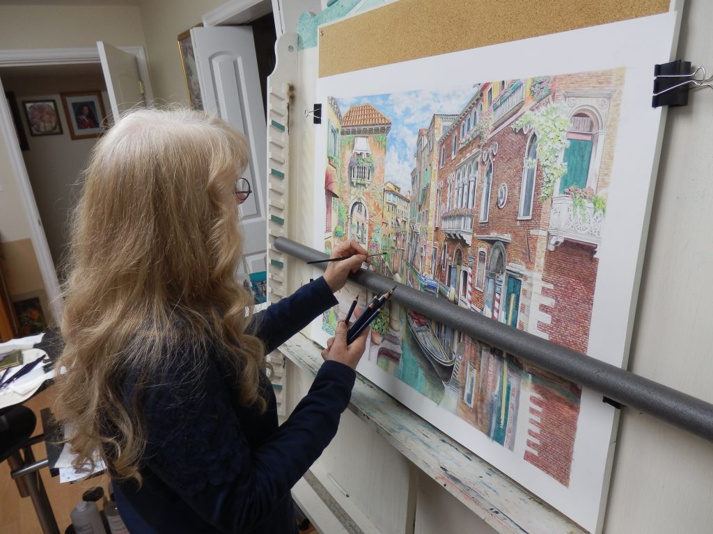
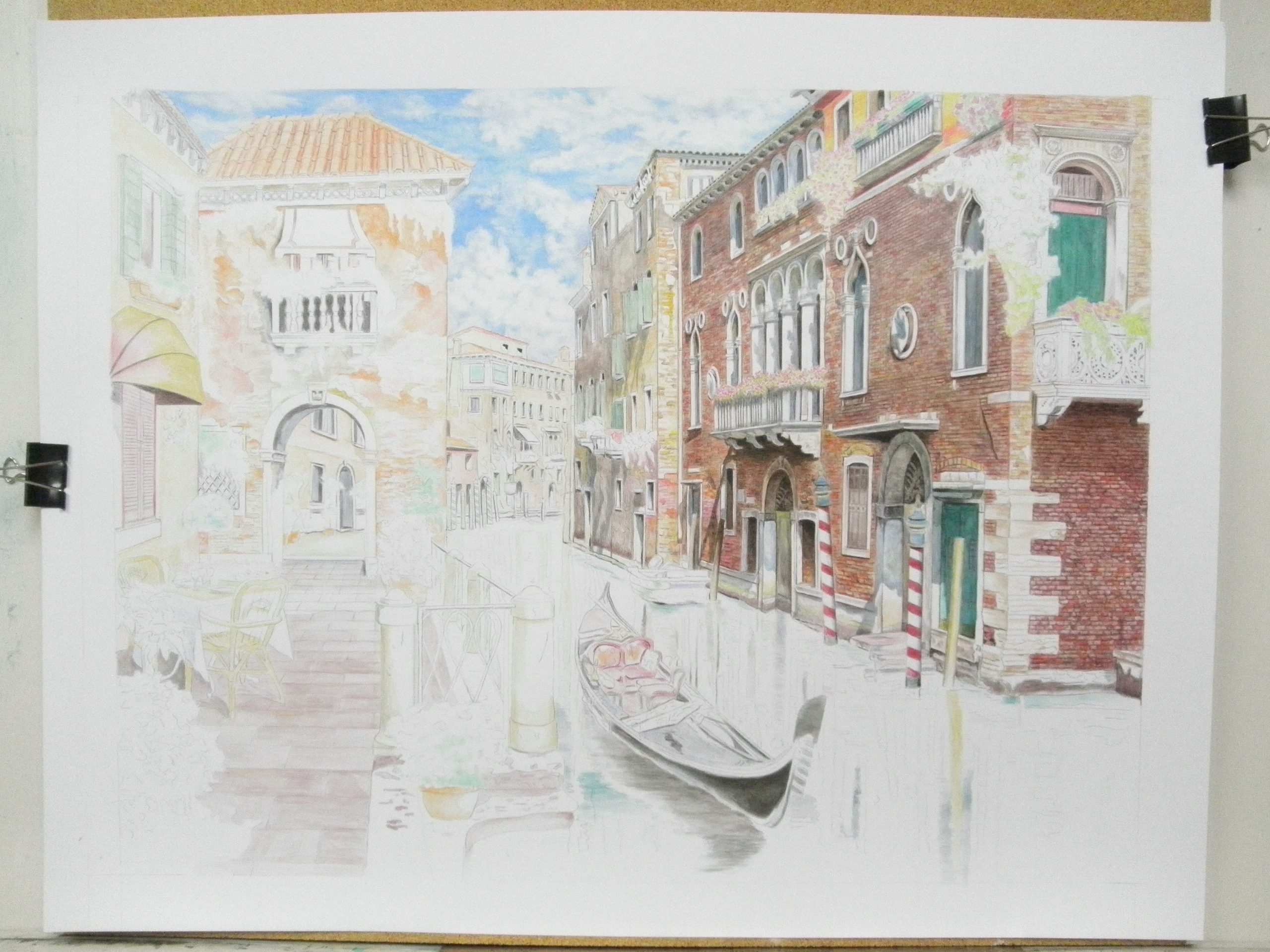
Another method I used was to wet a paint brush and take the ink pigment from the tips of the inktense pencils.
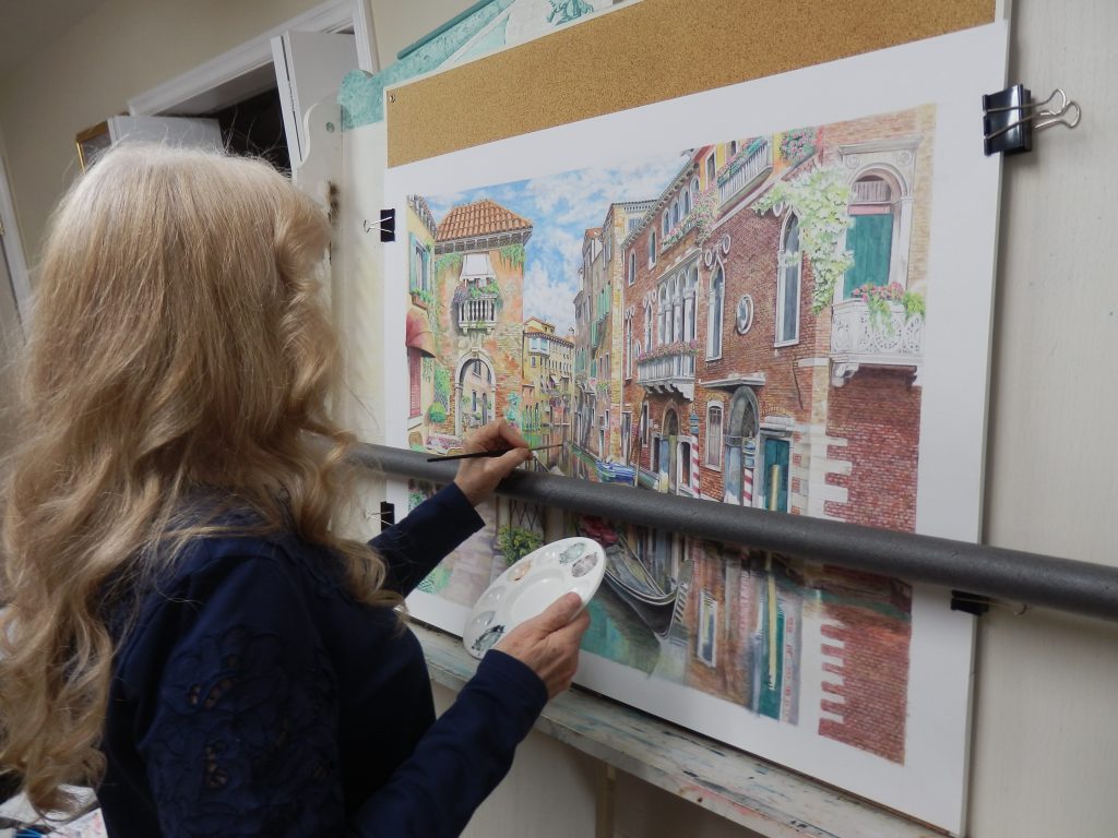
Another method that worked well for me was making an ink solution using the pigment and water in a water colour palette, then painting it on like a water colour paint. This allows you to mix colours other than what are supplied in the set.
After working with the pencils for most of the project , I purchased a small set of Inktense Blocks. Using a water color palette, this allowed me to shave pieces of ink pigment and make a fluid solution, rather than obtaining the pigment from the end of a pencil.
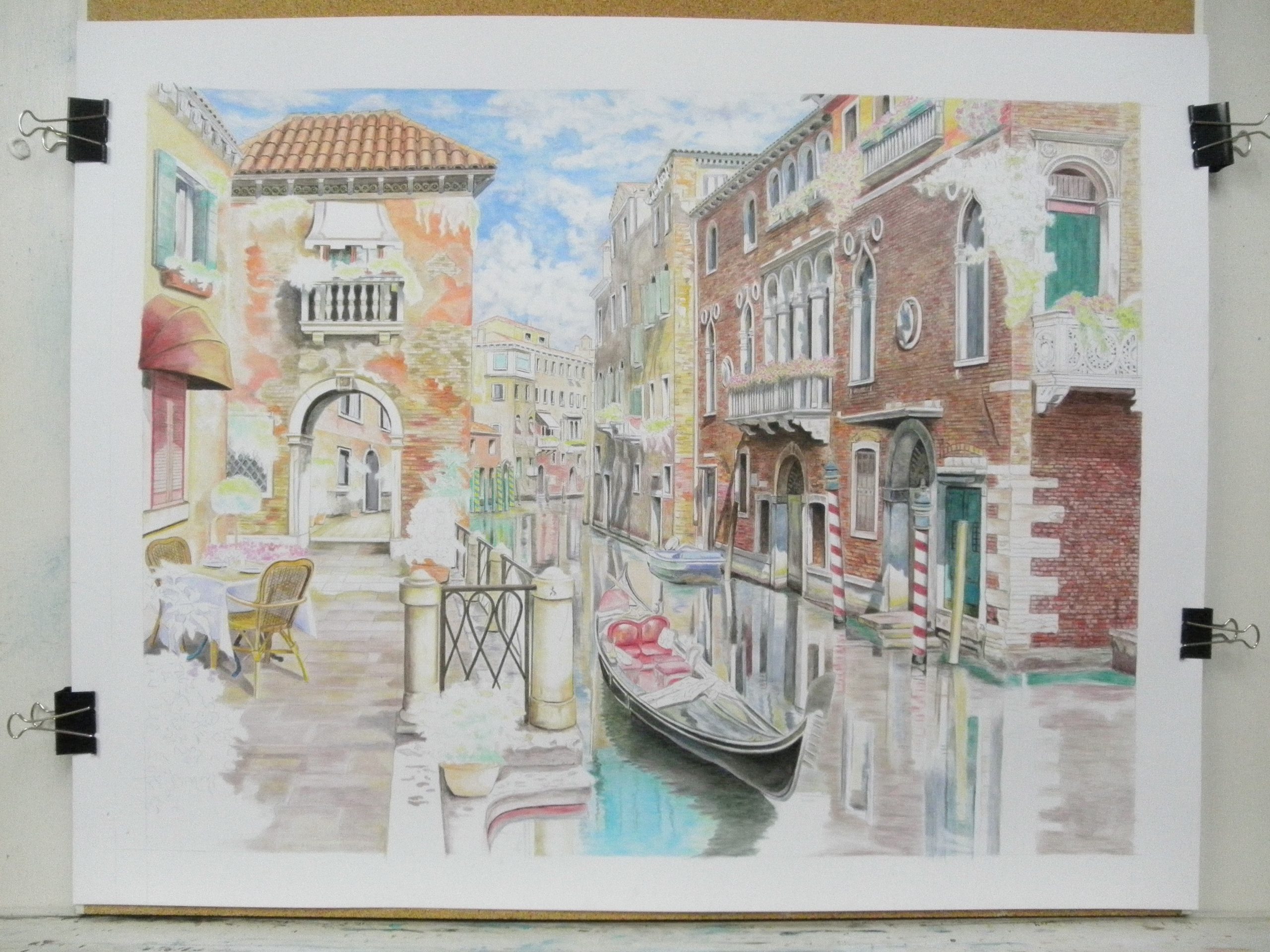
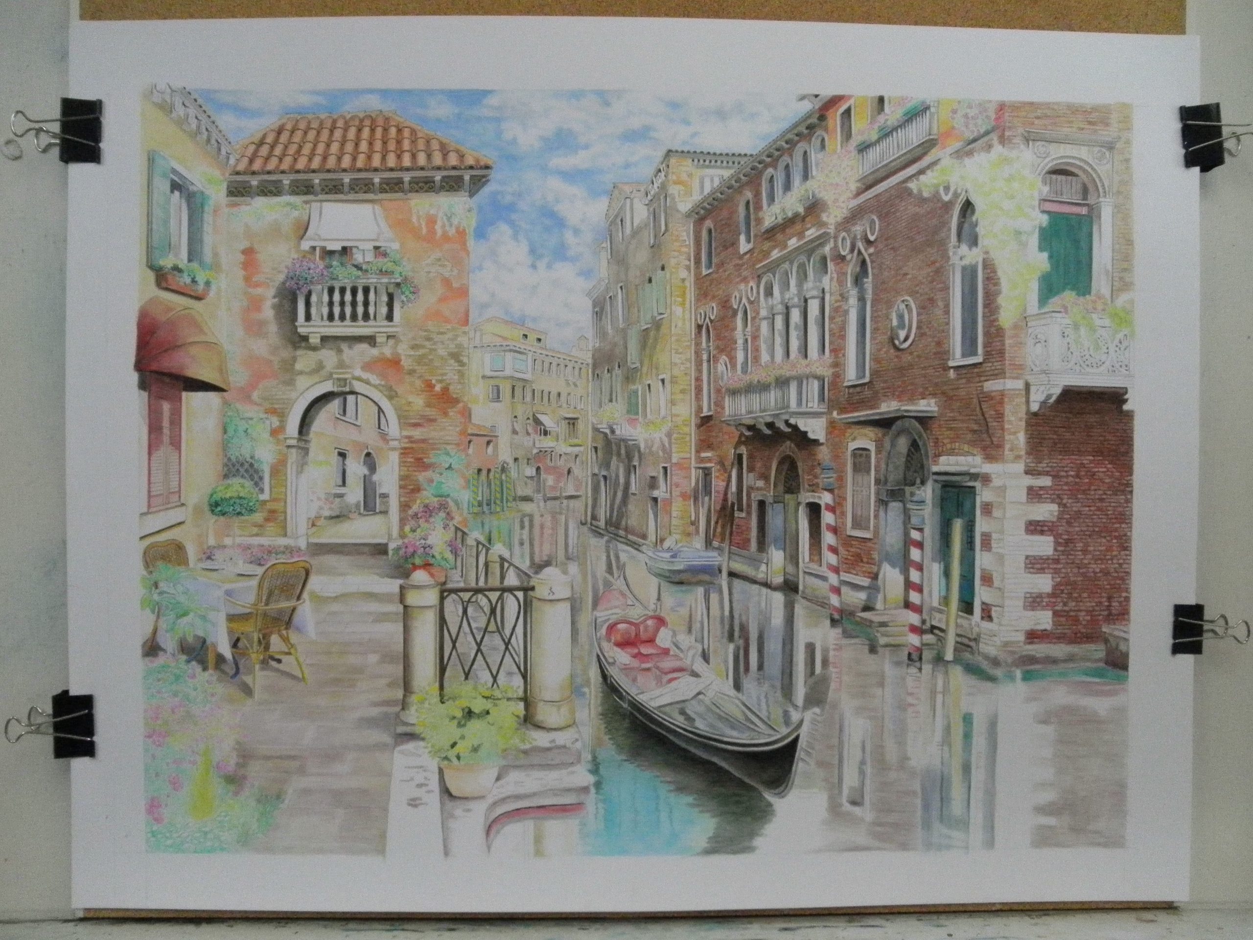
I used all the methods above to get the effect I wanted for this picture. It took many, many, MANY, layers of ink pigment to achieve the rich colours that I desired.
I really pushed the limit to see what could achieve from these Inktense pigments. It was a very lengthy and challenging project. I leave you with samples along the path, start to finish…
On a personal note…my audio companions for this project were: Joe Bonamassa (Live from the Royal Albert Hall), Gino Vannelli (Wilderness Road) and(More of a Good Thing) …Ciao.


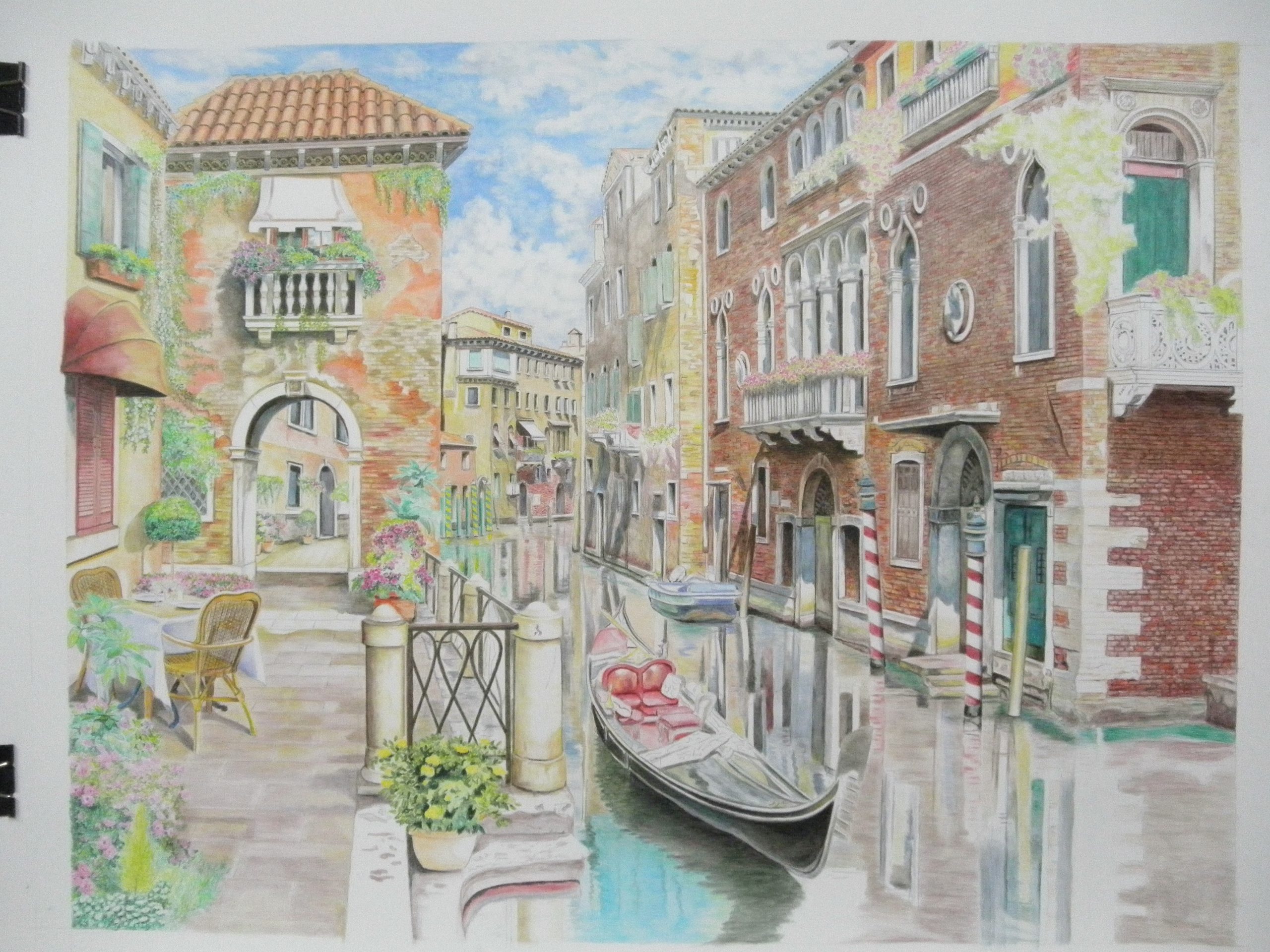
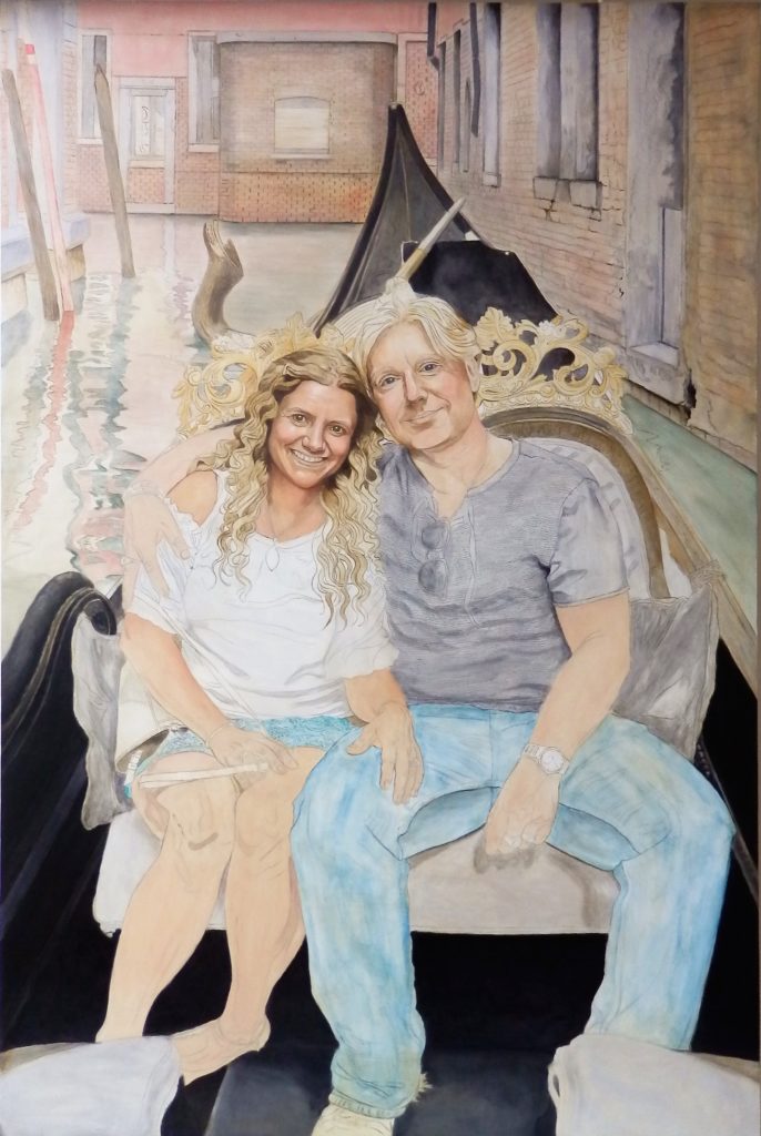
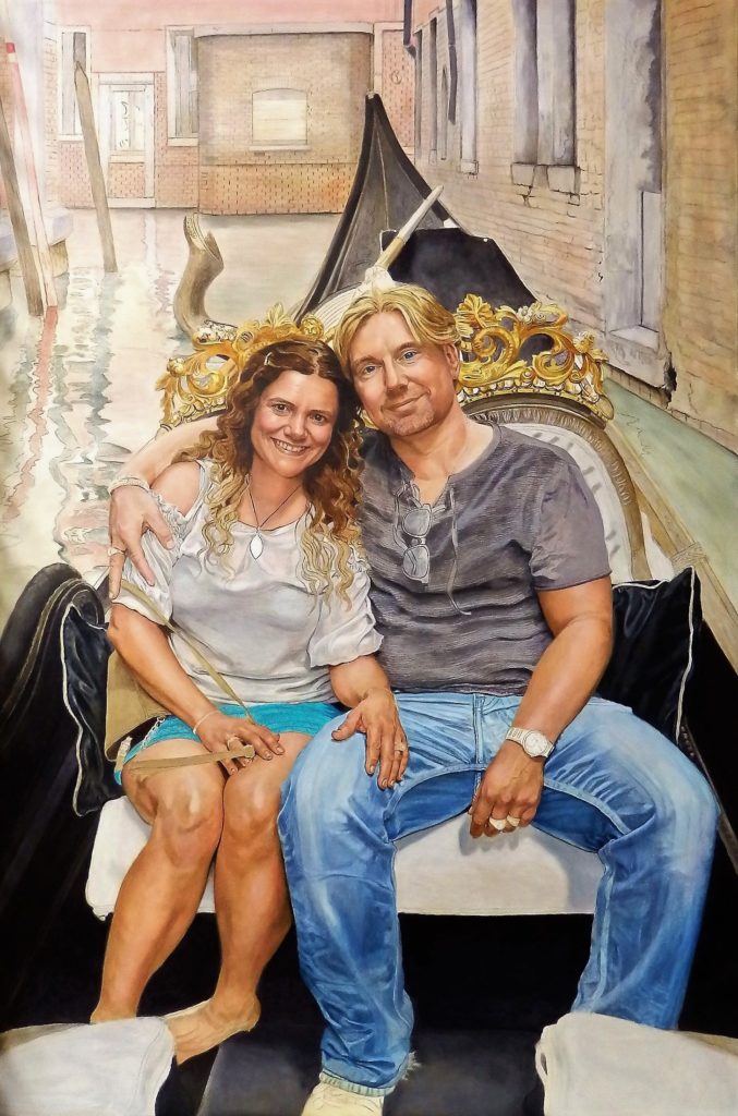
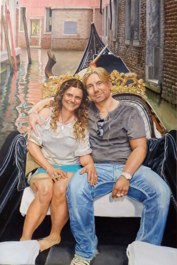
“Venice Gondola Ride”
This was a very personal project for me as it is from a snapshot of my daughter and her partner when they visited Venice. Being very fond of the picture (and of Venice!), and in my enthusiasm to put this moment to canvas, I overlooked my cardinal rule, “NEVER WORK FROM AN INFERIOR PICTURE!”
The picture was taken by the Gondolier, with a cell phone, and it was not set for the highest resolution. My mind was determined that this picture needed to find its way to my canvas and I didn’t realize the poor quality until after I had been “committed” to it. So for me, there was no turning back.
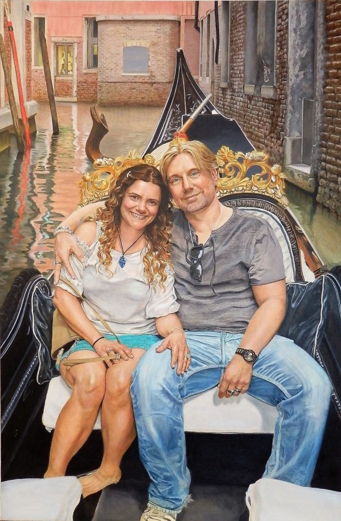
Throughout the process of painting this picture, I used over two dozen other snaps taken on the gondola ride, that would help me get an accurate vision of the surrounding area, coloring, lighting, etc.
The unfortunate thing about camera “snaps” is that if great care isn’t taken with angles, etc., it’s easy to get a distortion in the background, thus throwing off the perspective. As the gondolier was focusing on the two people in the boat, and probably very little else, the background and surrounding wall were out of proper perspective. So, my first challenge was to correct this, and it proved to be a rather lengthy and labour intensive exercise!
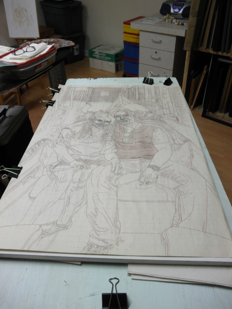
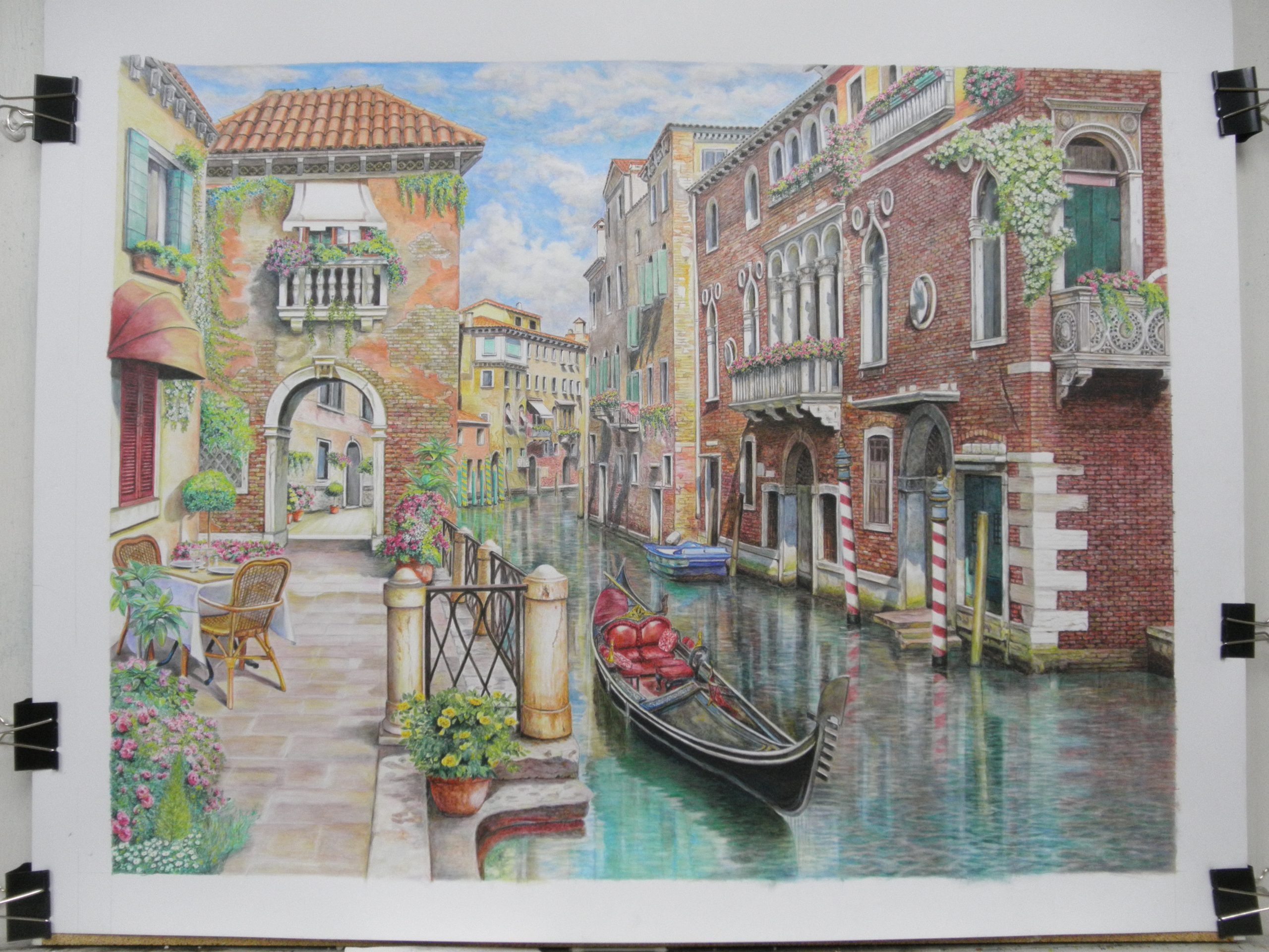
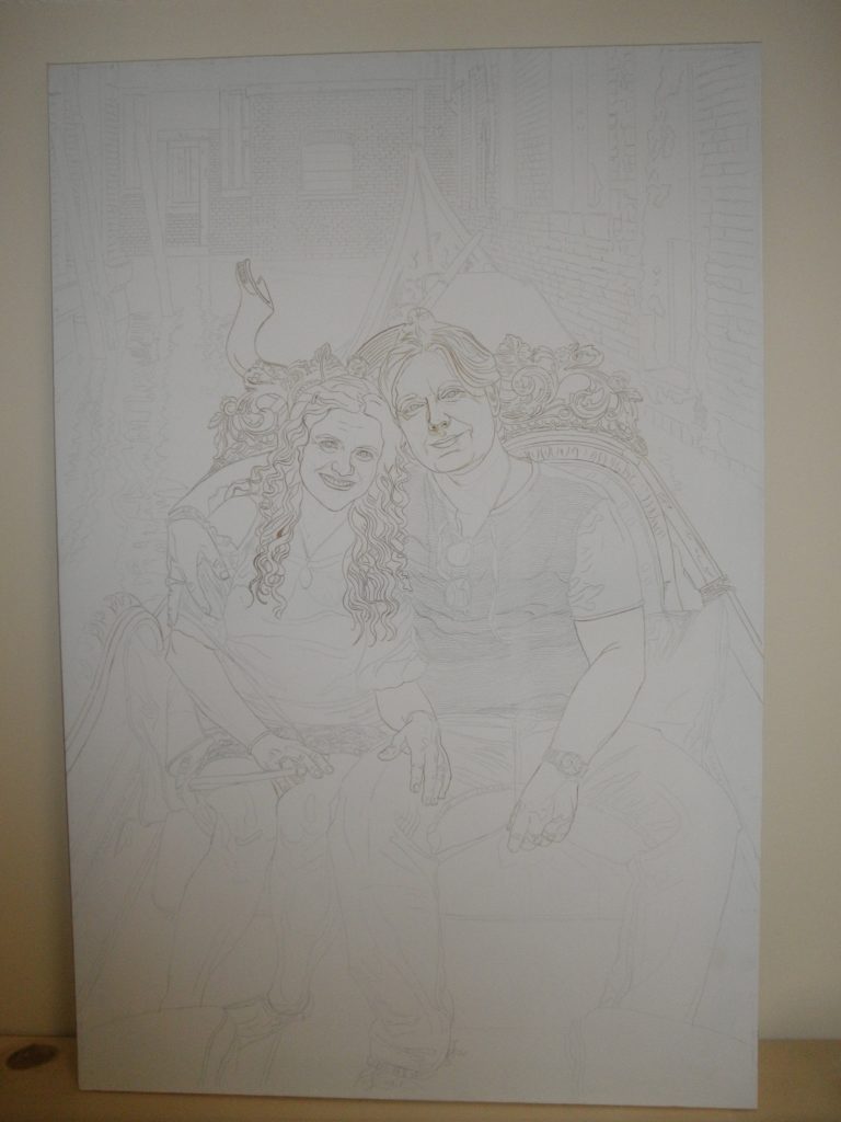
…Once the drawing was completed, it needed to be transferred to the canvas using graphite paper…
(Completed transfer of drawing onto the canvas.)
(Close up of portion of completed transfer to canvas.)
…After the transfer is complete, the drawing lines are then gone over with acrylic paint to “fix” them…This is important so that if I have to take paint off to correct something later, I will not lose my original drawing…
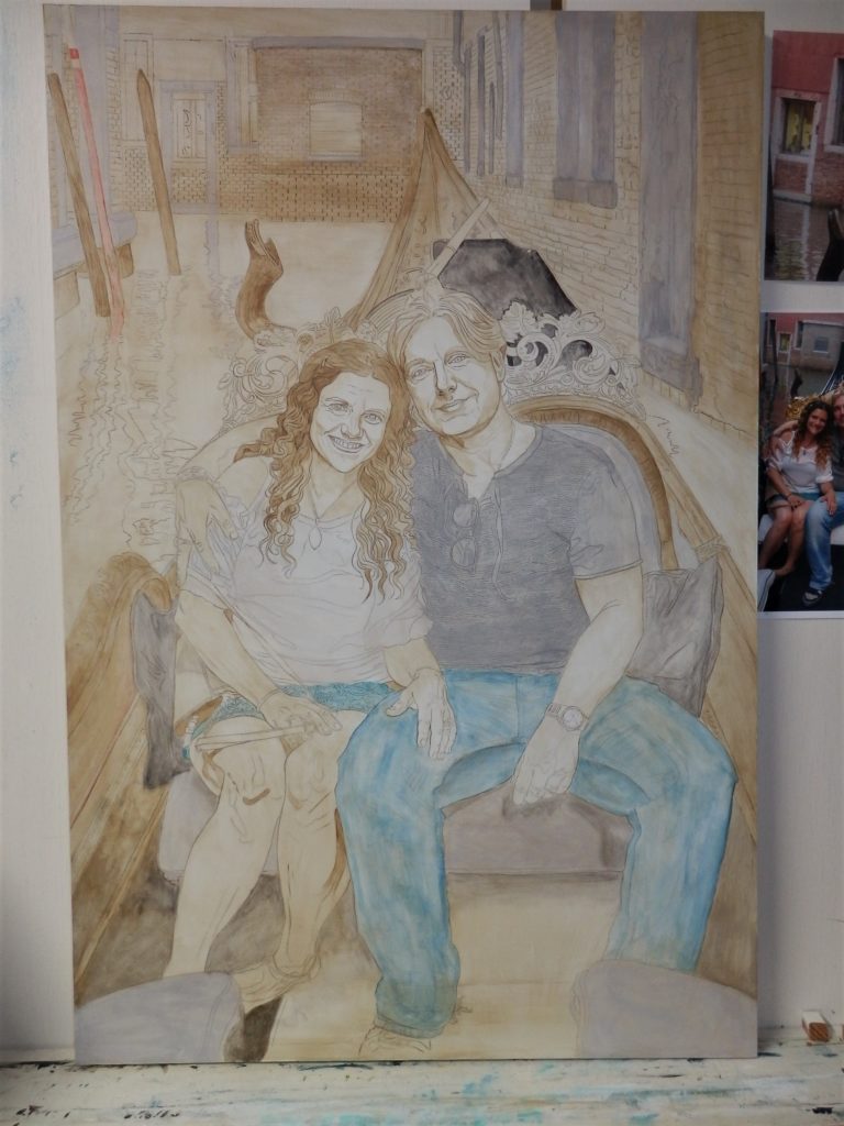
…A light acrylic wash is then put on to get rid of the stark white canvas, enabling tonal values to be judged more easily…
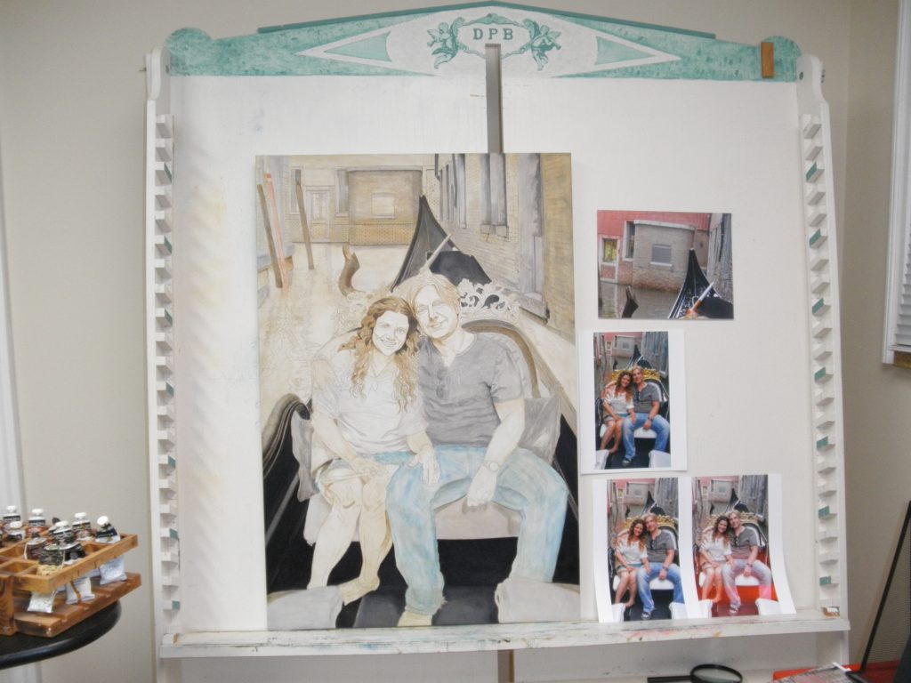
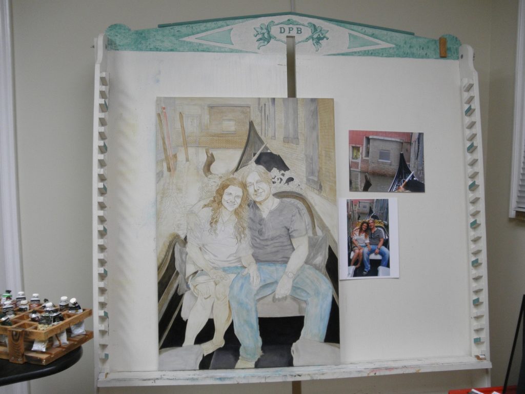
Color Adjustment
At this point I have to figure out the color scheme of my picture. The coloring of the original photo was too dark and orange toned to be natural.
I did what image adjustments of the photo that I could on the computer, and had 3 different color schemes printed out, but in the end, most of the coloring, especially for skin tones, was taken from other snapshots (selfies) that were taken on the ride.
I used the colors as they appeared directly from the computer screen, which looked more natural, rather than the printed versions, as the printed pictures seemed to mess up the colors. (Perhaps software to sync the computer screen colors to the printer would be a good investment!)
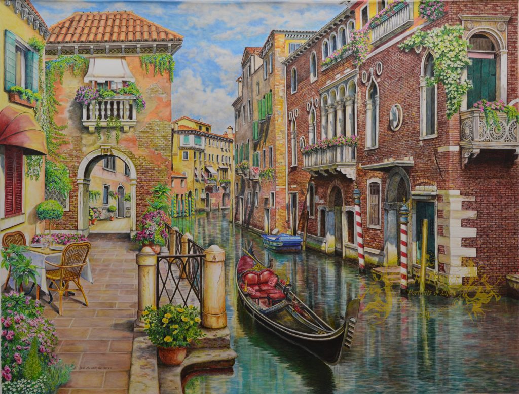
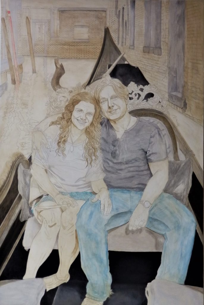
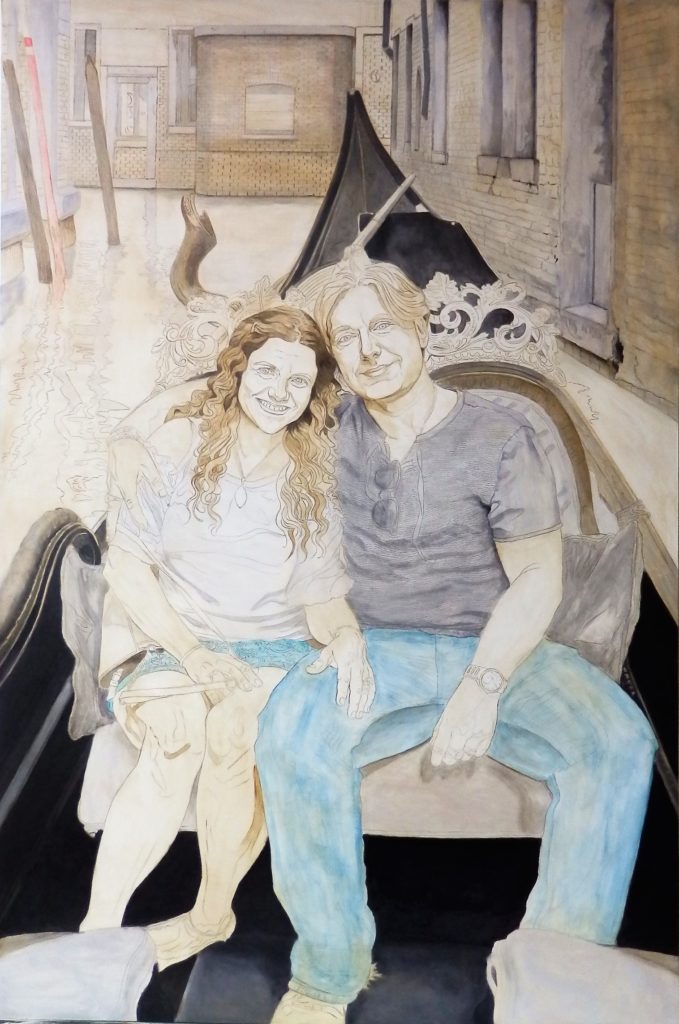
The next step is to start blocking in the colors with oils, starting with the darkest colors and progressing through the lightest…
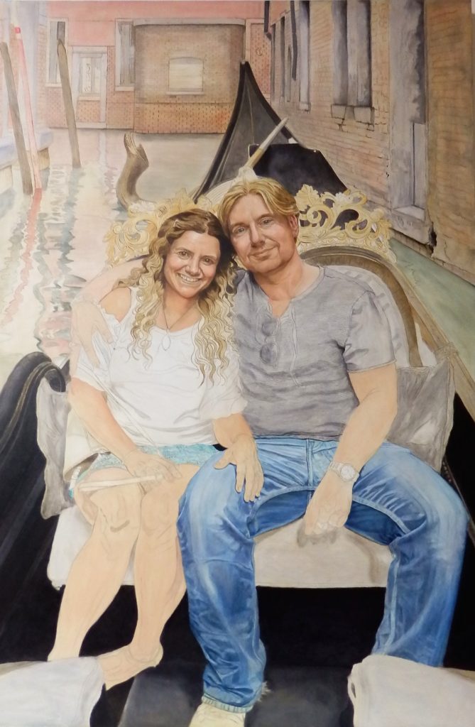
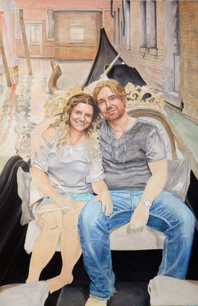
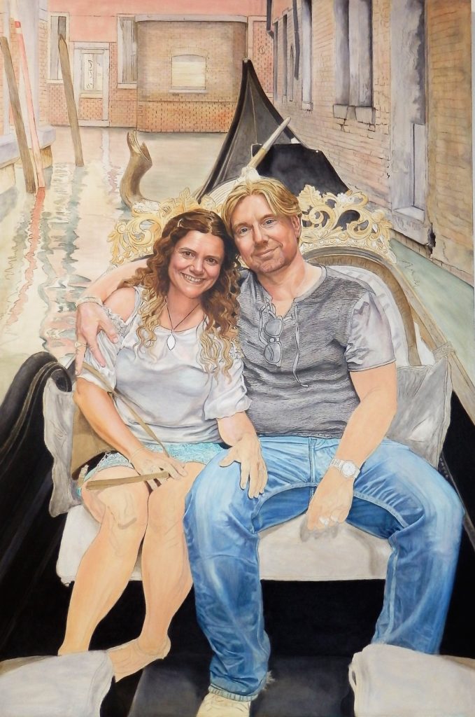
As this is also “day 1” with oils, and blocking in is part of the oil painting process, I will forego the tedious details and present a gallery depicting the progress of the painting and identify the image in terms of days since starting to use oils.
I would also like to point out that I am using “dream canvas” (which is made from a patented, nylon coated fabric), and I need to always be cognizant of how much paint I am using, as the “tooth” of canvas is very fine .
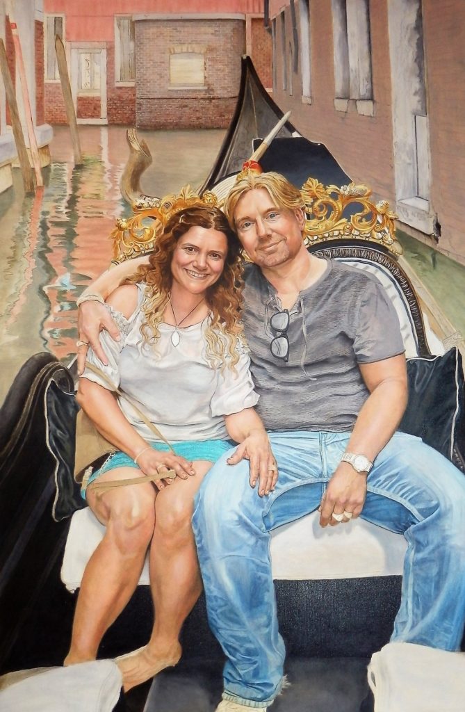
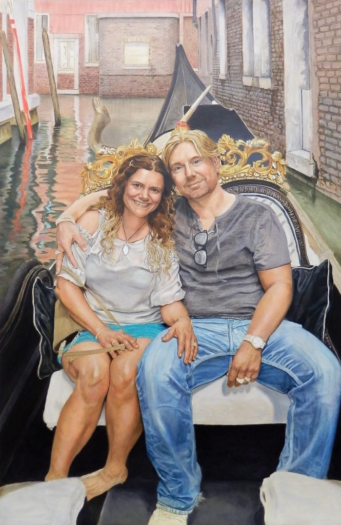
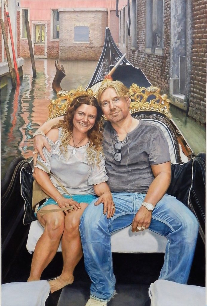
(Click on image for a slightly larger view)
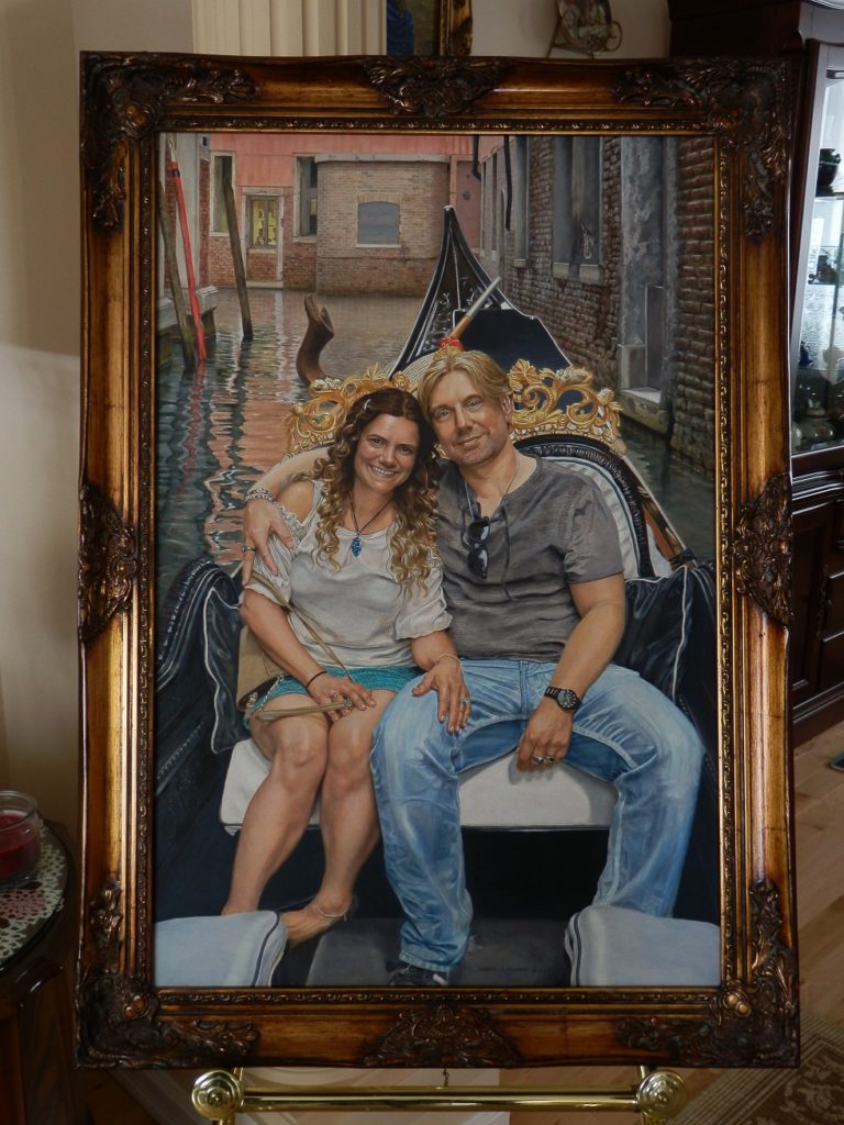
It took 97 days from the time I picked up my brushes and loaded my palette with oils, to completion. Because I had broken my cardinal rule, it took an additional 4 months to prepare, to get from conception to the transfer of the drawing onto the canvas.
It was a labor of love, and probably one of my most challenging endeavors…Worth it?…Absolutely…Would I do it again?…Not without the proper photo…. The completed “Venice Gondola Ride”
Just an aside…my audio companions for this project were: Joe Bonamassa (An Acoustic Evening at the Vienna Opera House; Live at Carnegie Hall – An Acoustic Evening; and Live from the Royal Albert Hall), Gino Vannelli (Live in LA), and, for occasional variety, the local radio station. And no, I do not get royalties for mentioning them…Ciao.